

Brand Case Study
North/South
creating a cheeky canberra brand people actually want
North/South is a Canberra born brand built on a simple idea.
We think you’re boring too.
When I first arrived in Australia, I stayed with family in Sydney before making my way to my new home in Canberra. From there, I was asked “…why on earth are you moving to Canberra?”
That was my first taste of anti-Canberra opinions that I would quickly learn gripped most of the country outside of the territory.
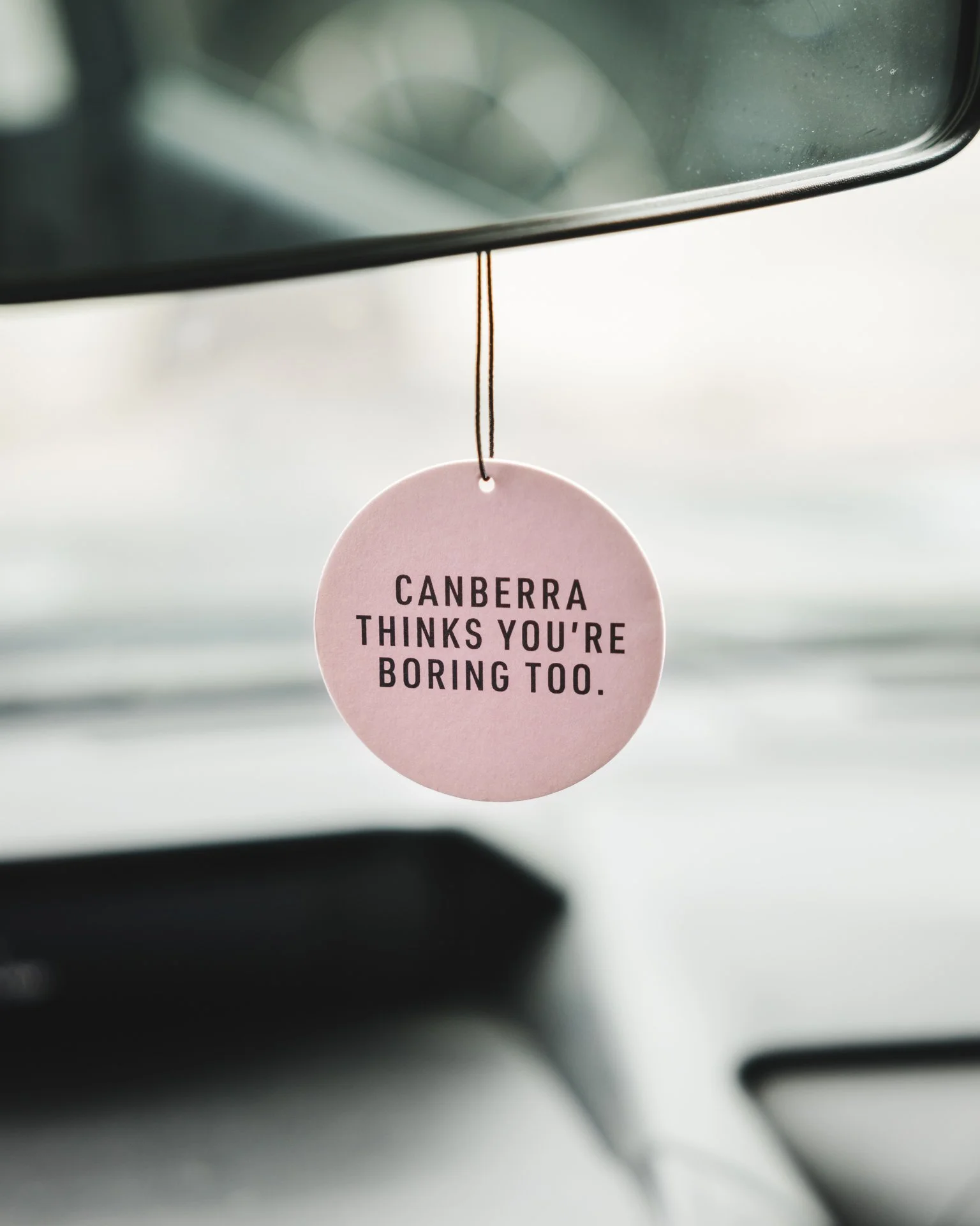
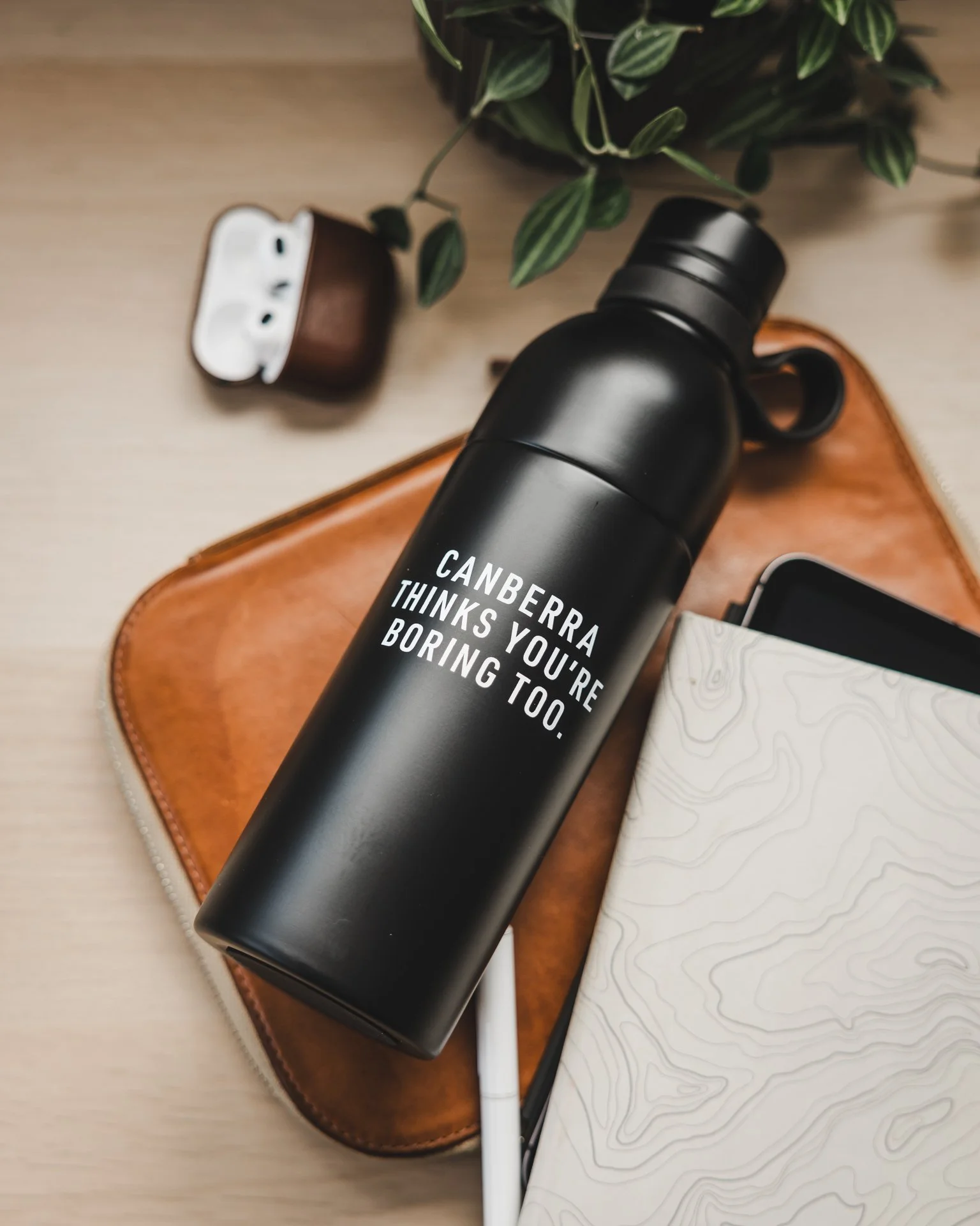
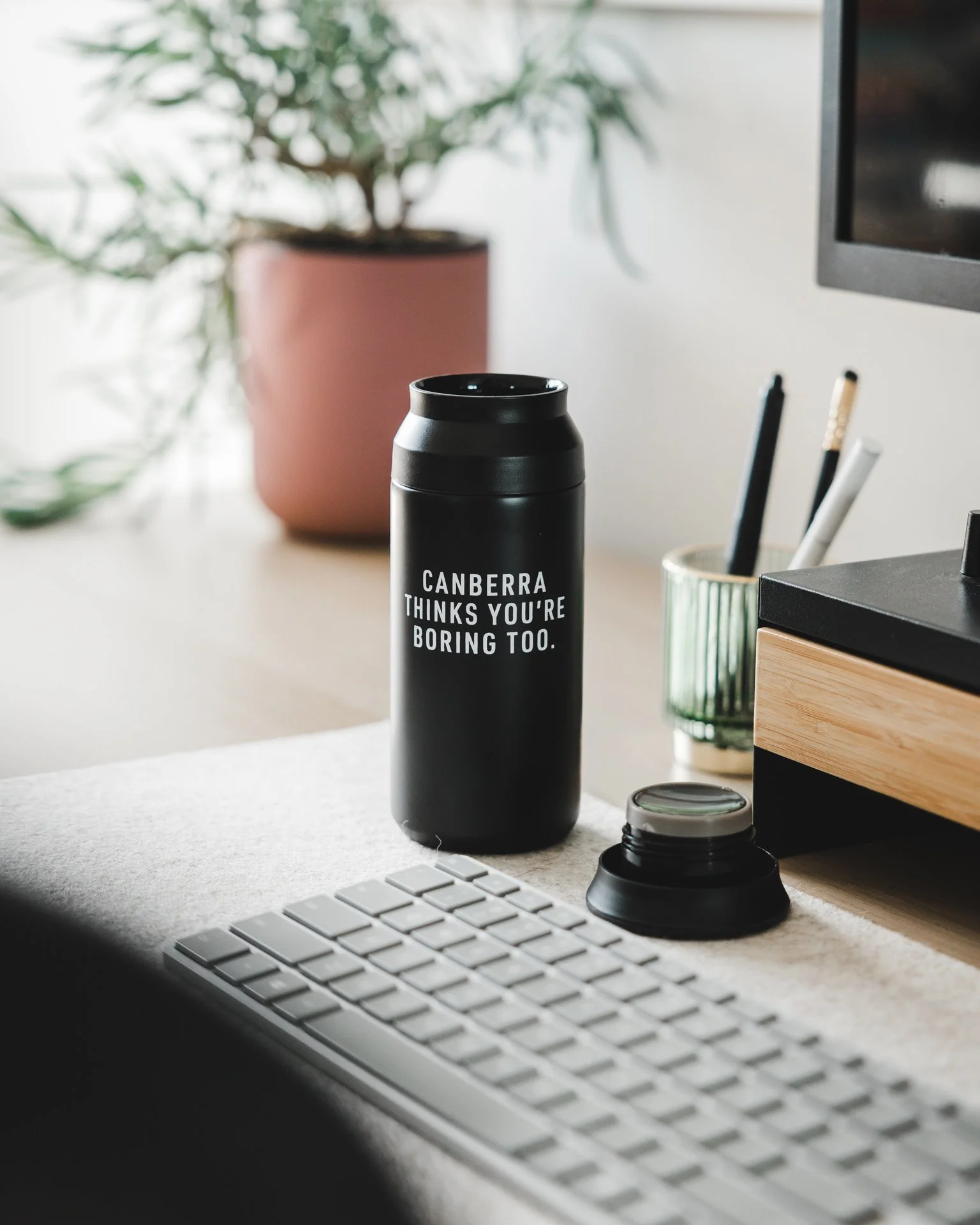
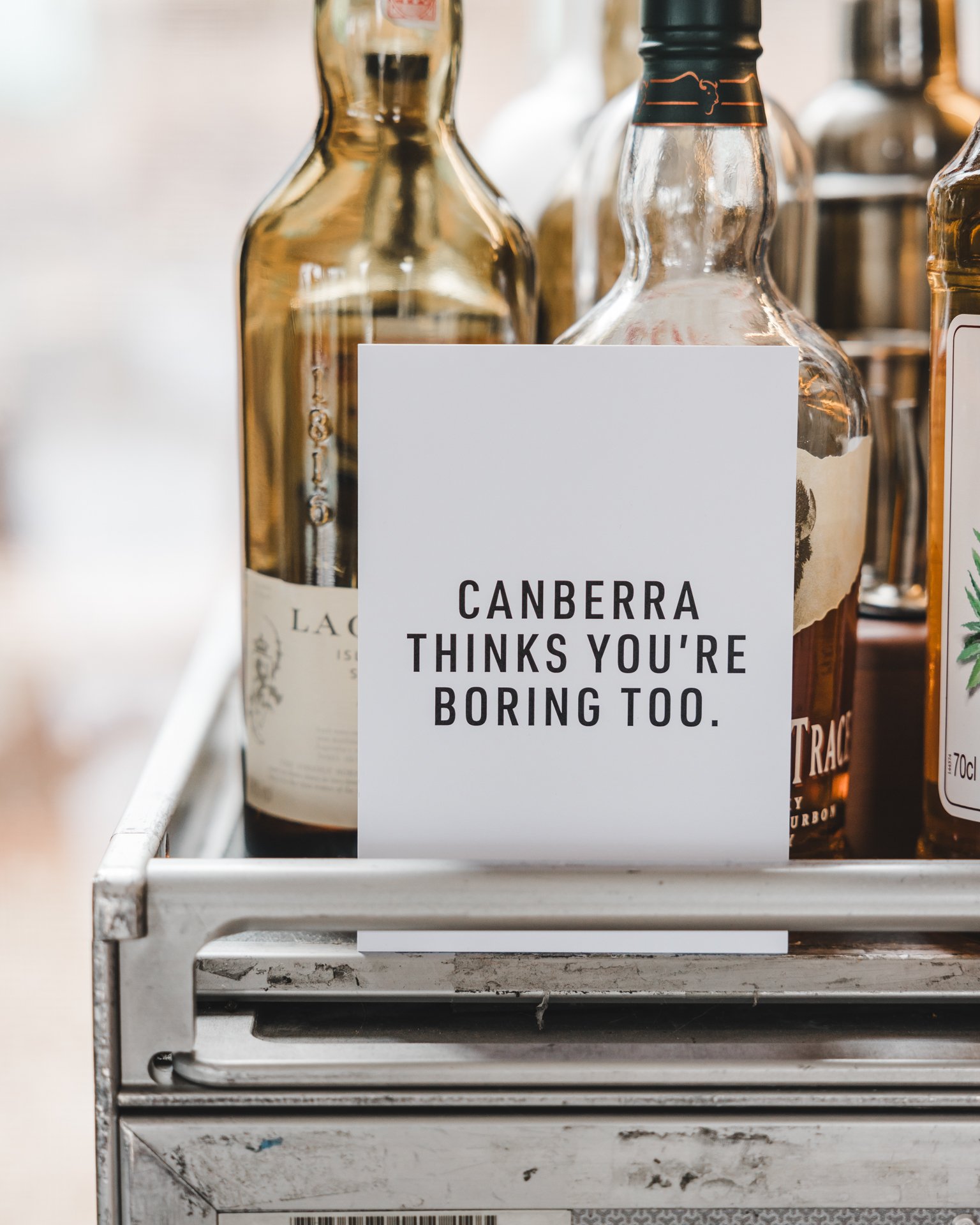
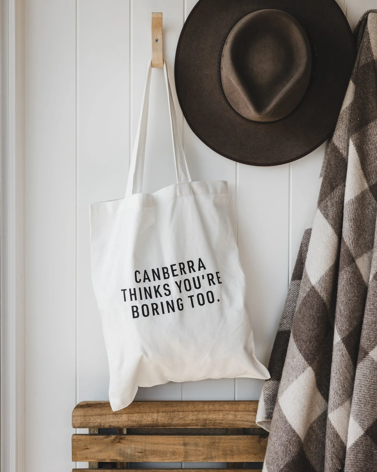
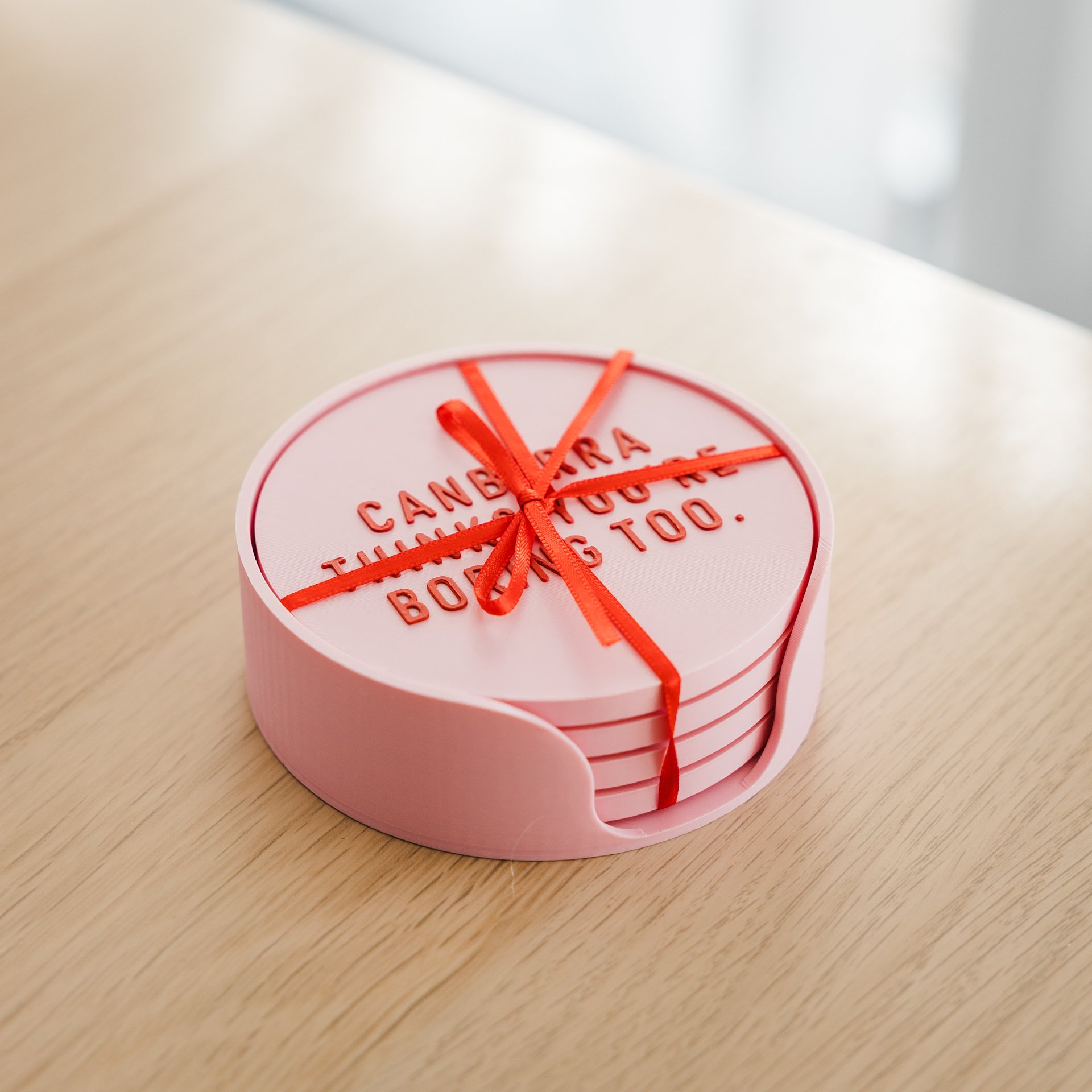
While the agency I was working for was pitching for a Canberra Tourism project, I thought of the line “Canberra thinks you’re boring too” as a cheeky way of acknowledging the city’s reputation, and biting back.
The name was adopted from a personal brand I had made for my partner and I (being from the north and south hemisphere), but it seemed to suit a brand made for Canberra perfectly with the city being divided by north and south of the lake. I developed the brand, products, photography, and e-commerce experience to turn that insight into a business and a product people proudly display.
This case study shows how a local cultural insight became a fully realised retail brand and adopted as the unofficial slogan of the city.
the challenge
canberra has a reputation problem.
To most Australians it’s a political city with nothing interesting going on.
But locals know a different Canberra. It’s a city full of world class restaurants, incredible access to nature, craft beer drinkers, lake walkers, and people who quietly love living here.
the opportunity
canberran’s are a very proud people.
When first moving here, it was very apparent how fiercely proud Canberran’s were of their city.
The opportunity was to build a brand that captured that self-aware Canberra humour.
It’s not completely defensive, it’s part patriotic, part cheeky.

brand strategy
The brand is built on a simple tension.
Outsiders think Canberra is boring. Canberrans know better.
North/South leans into that tension rather than fighting it.
The tone is cheeky, dry, self-aware, and proudly local.
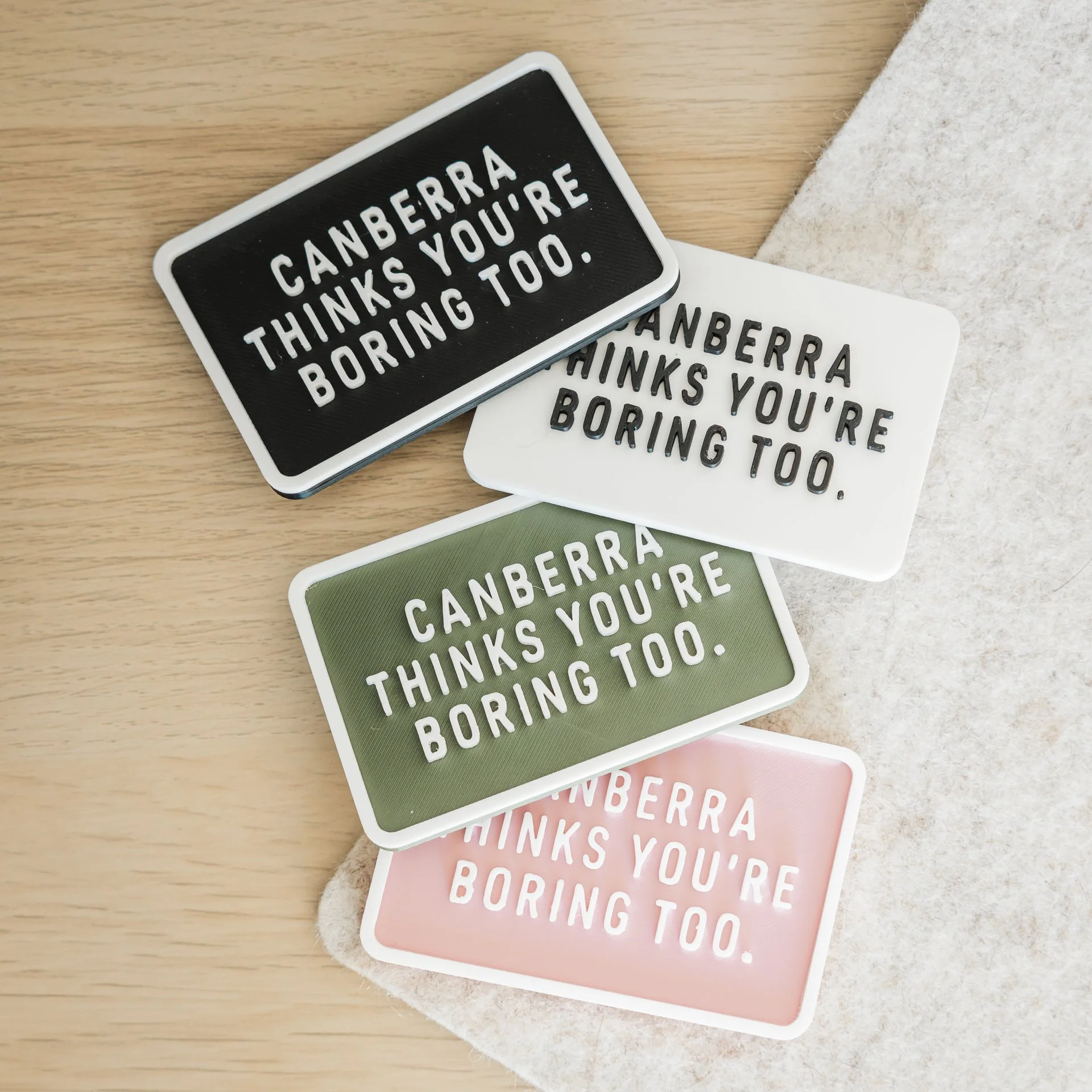
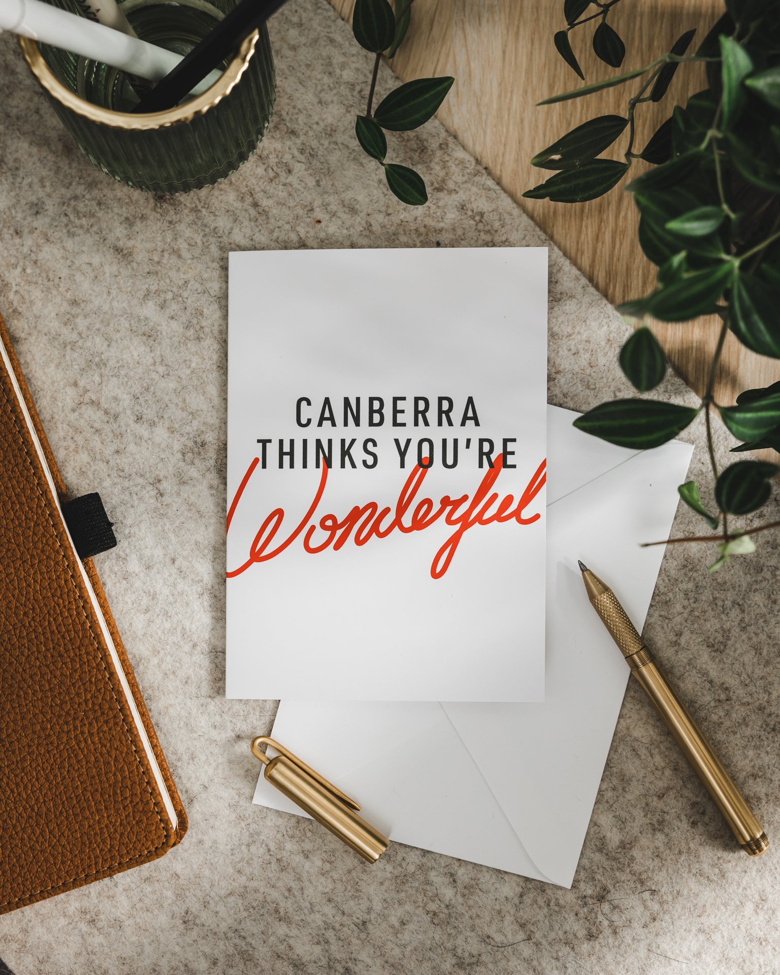
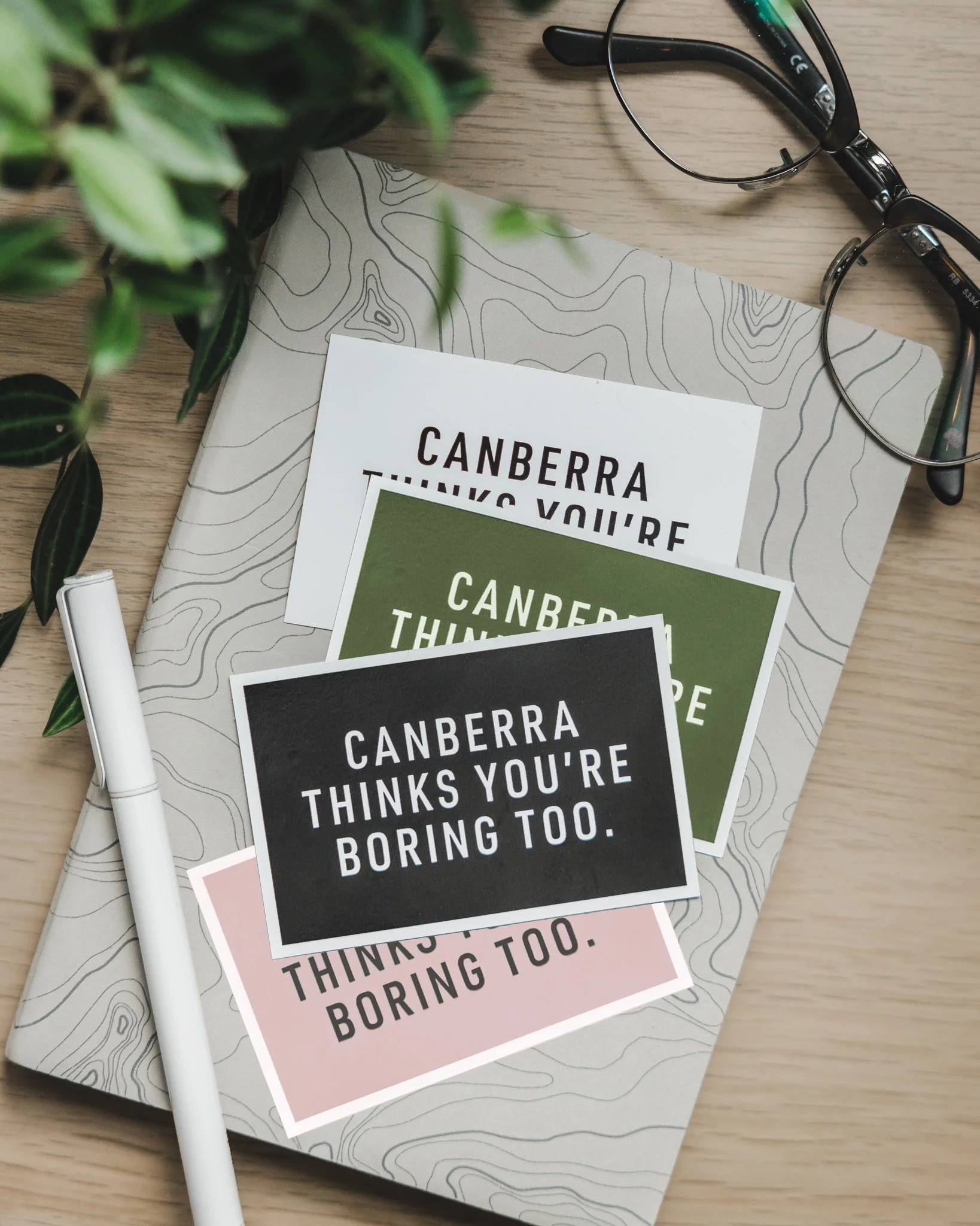
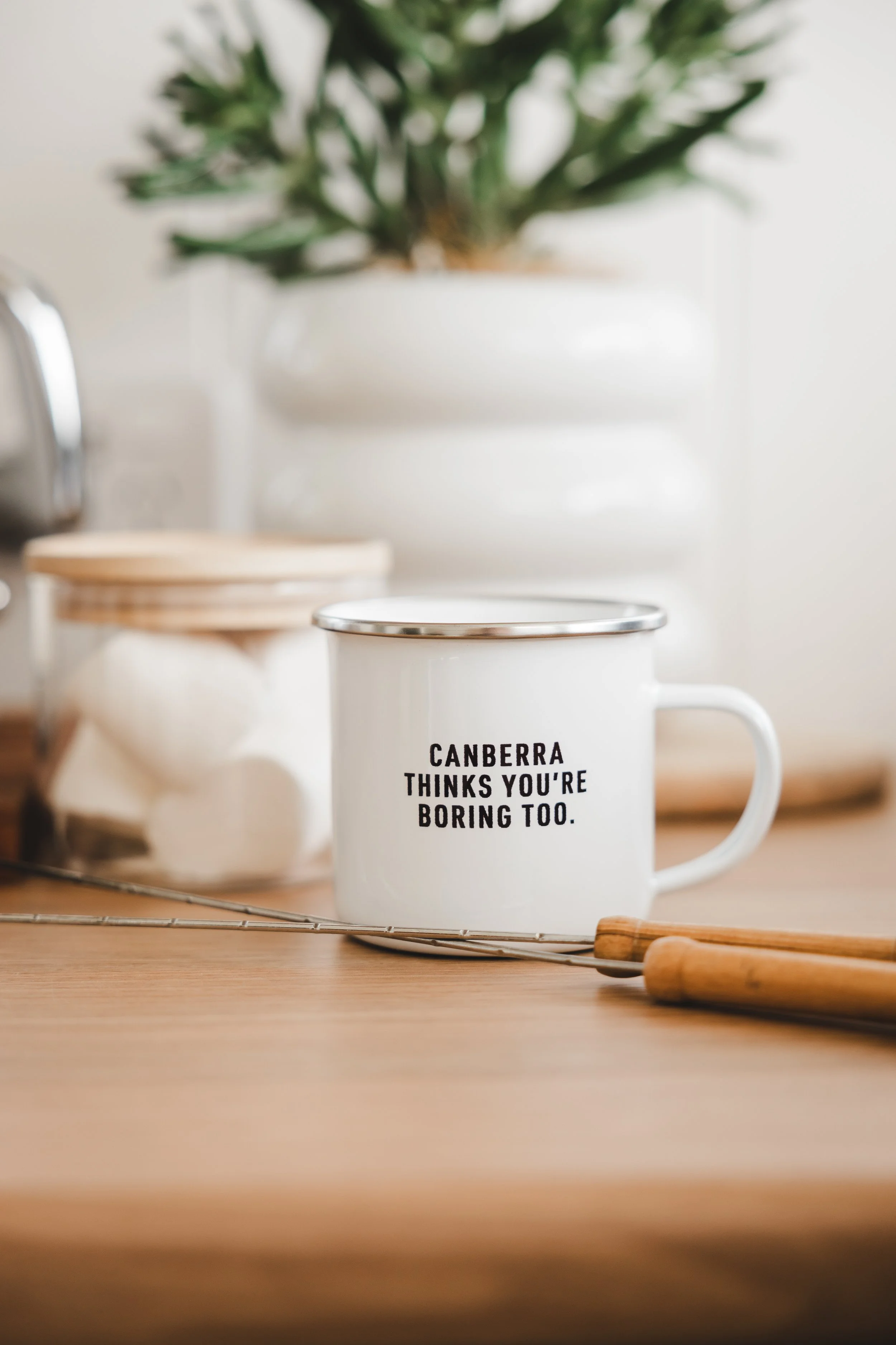
Products are designed to feel like an inside joke for locals. If you know, you know. Our products are purchased either as badges of honour or as tongue-in-cheek gifts to interstate friends and family.
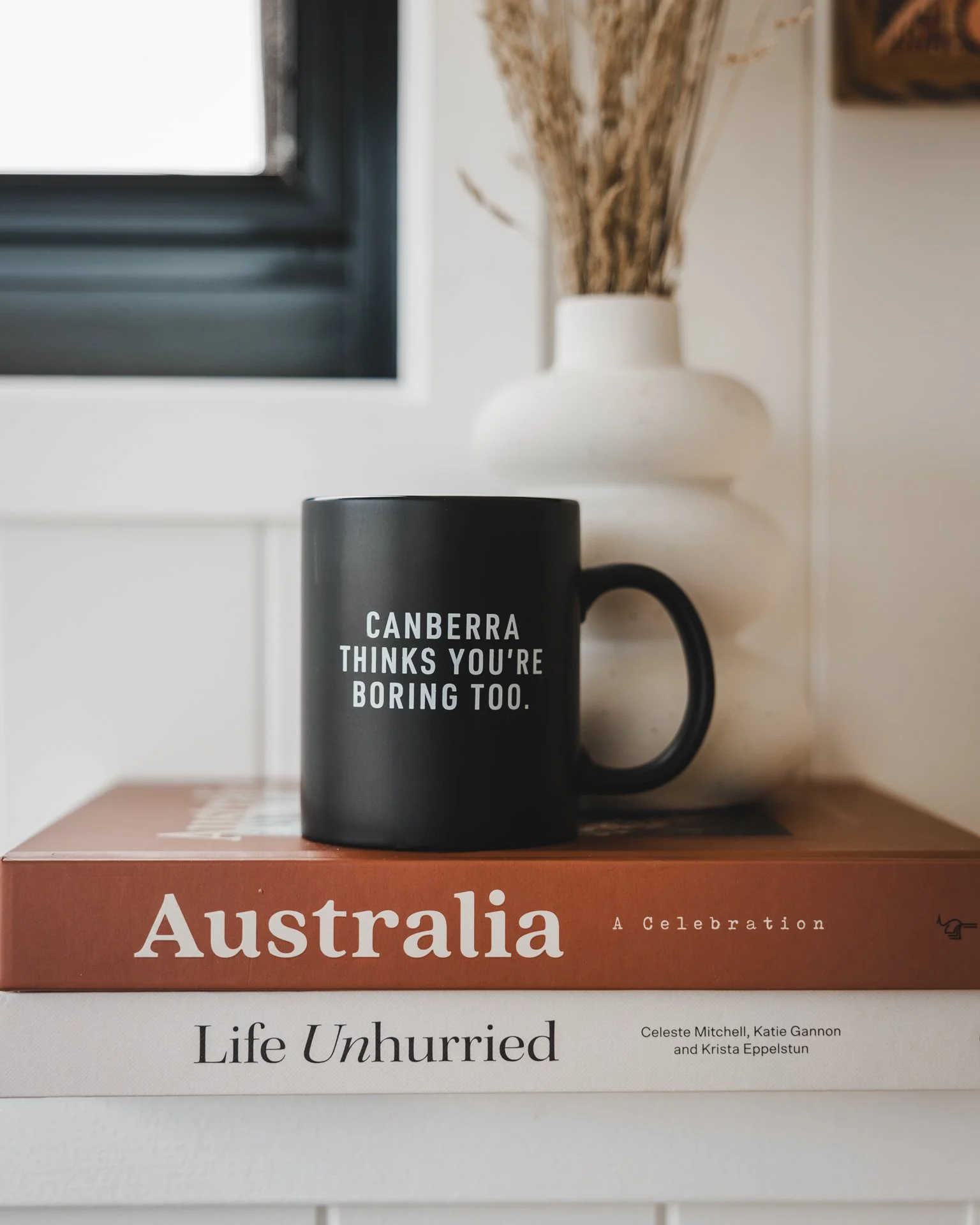
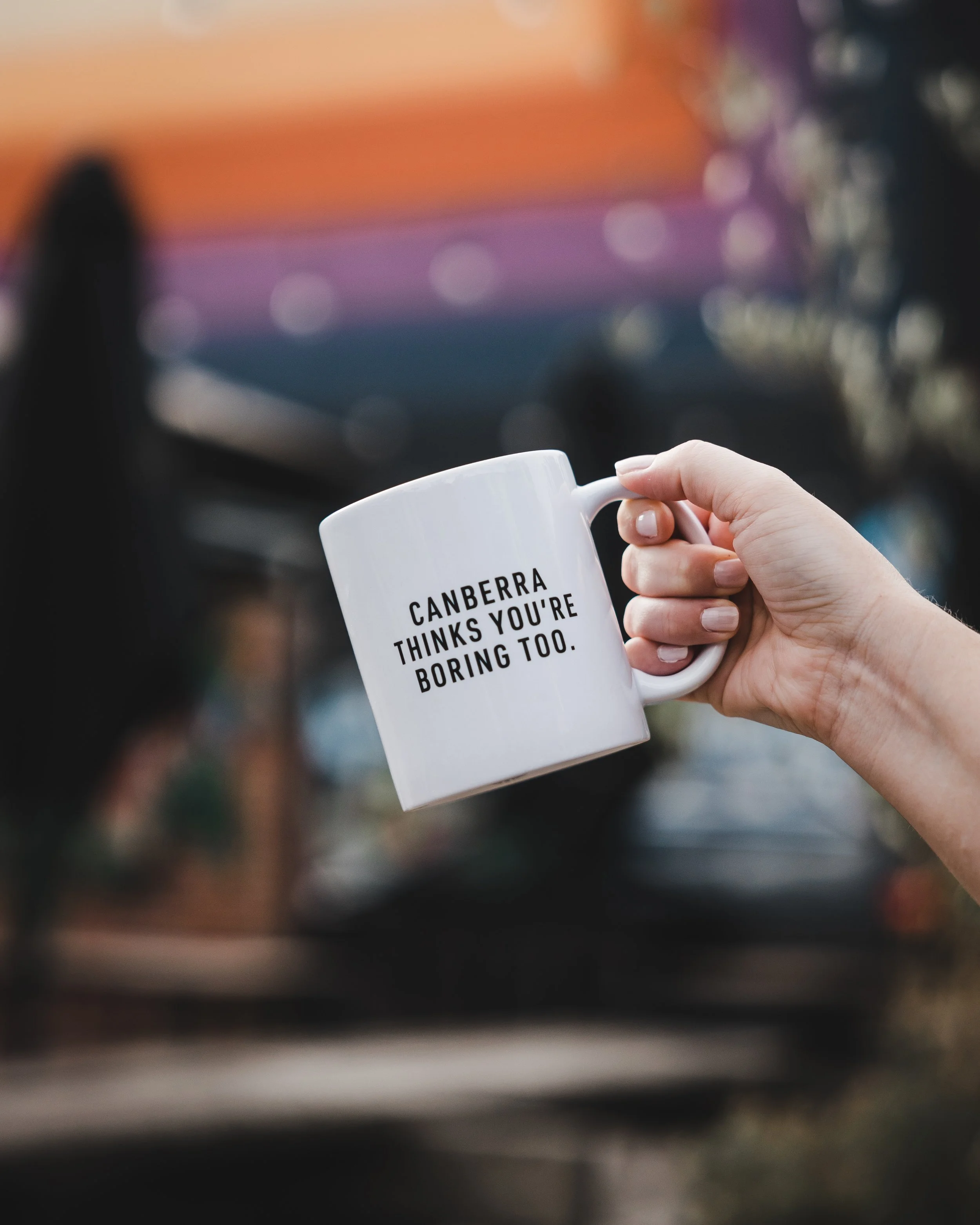
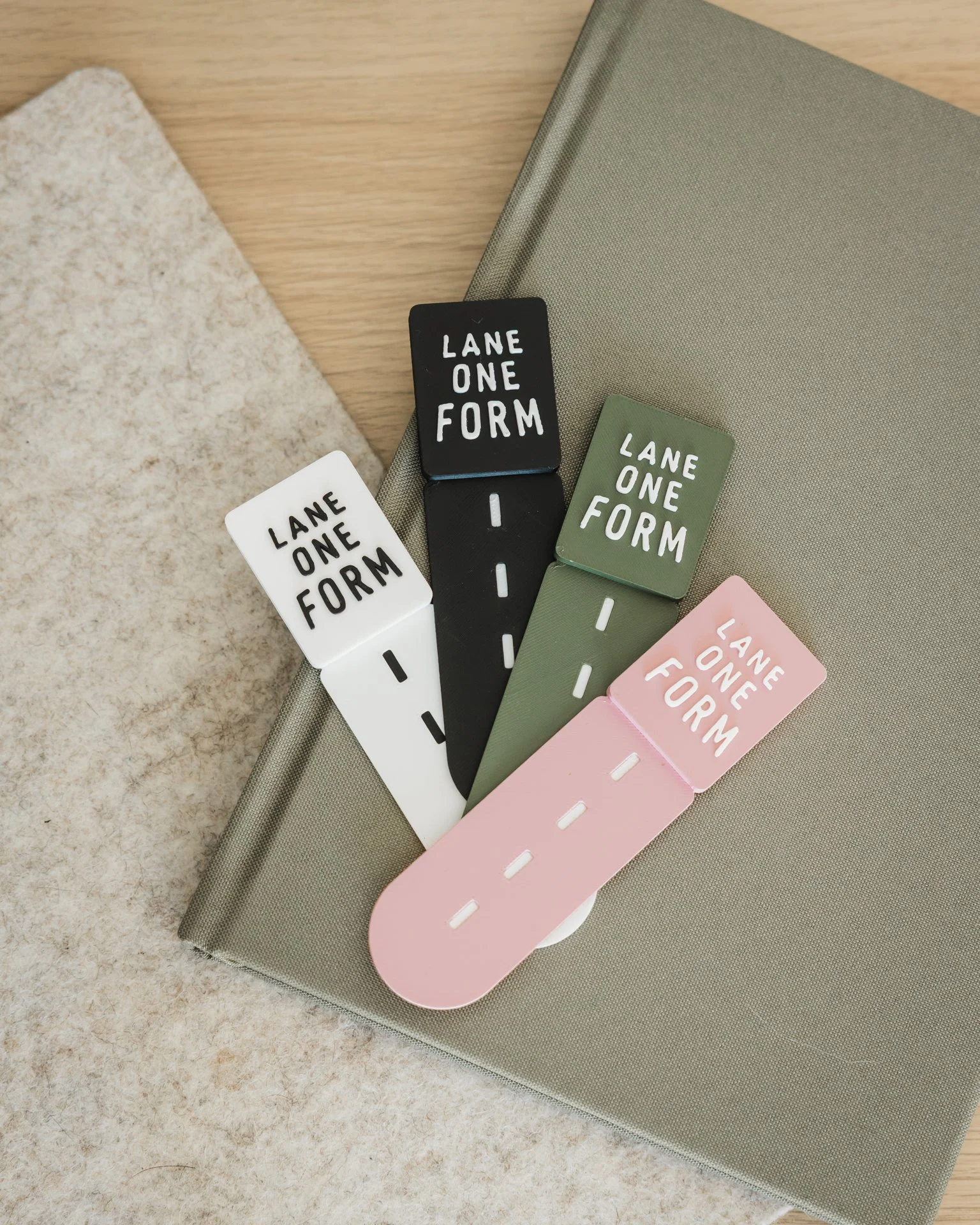
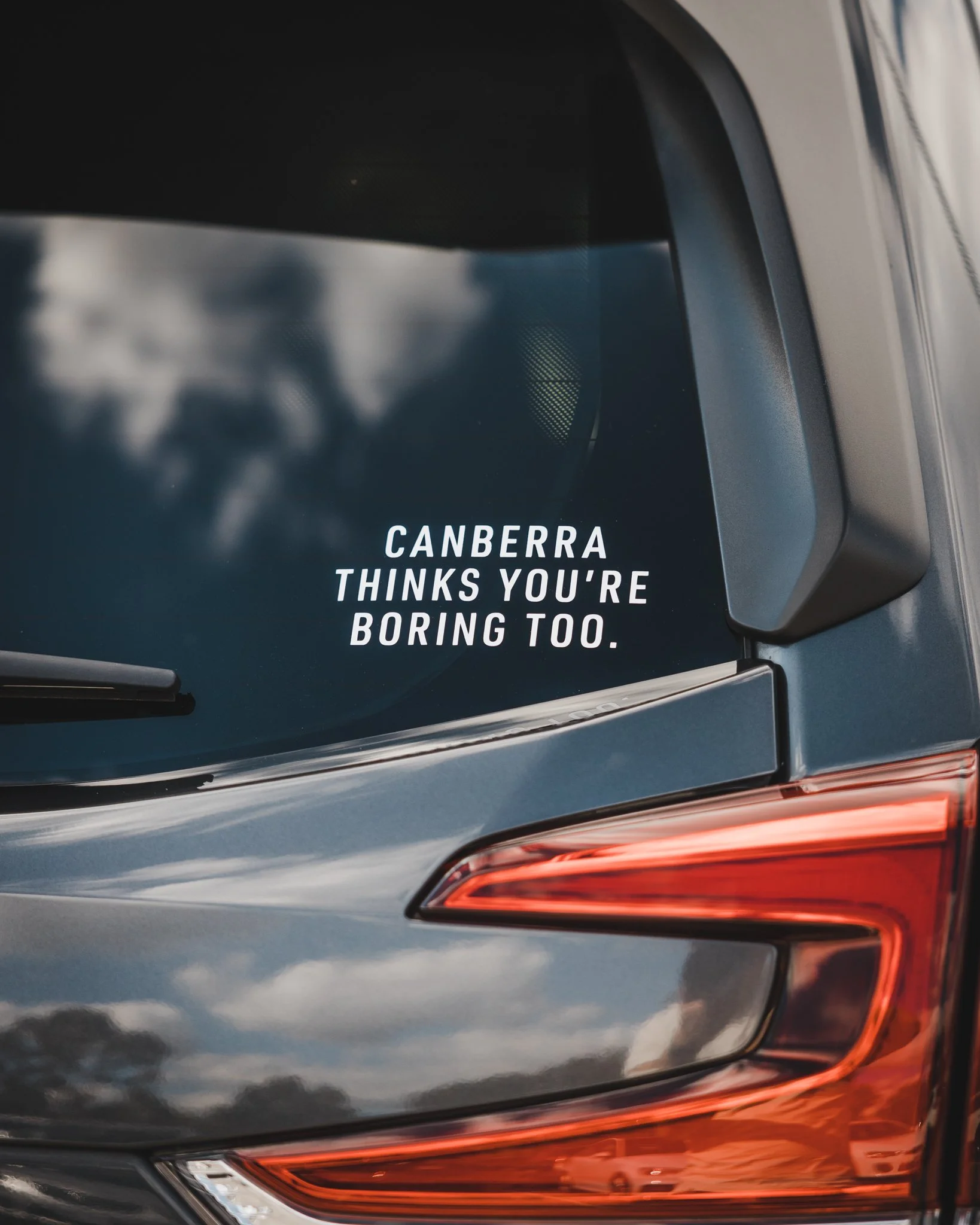
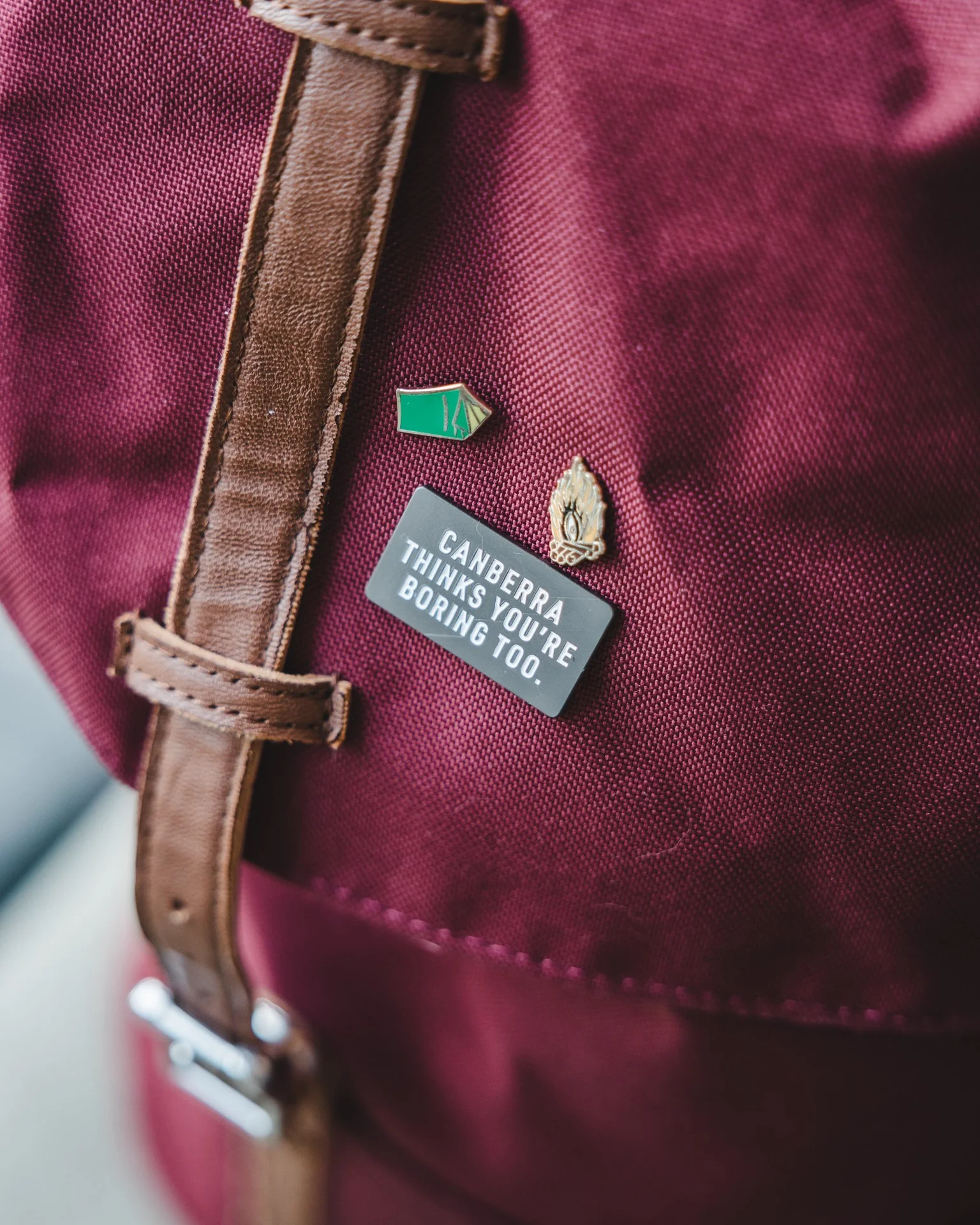
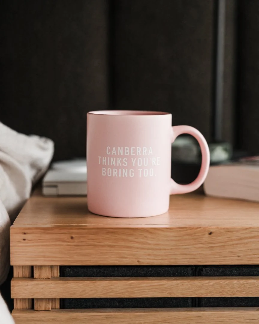
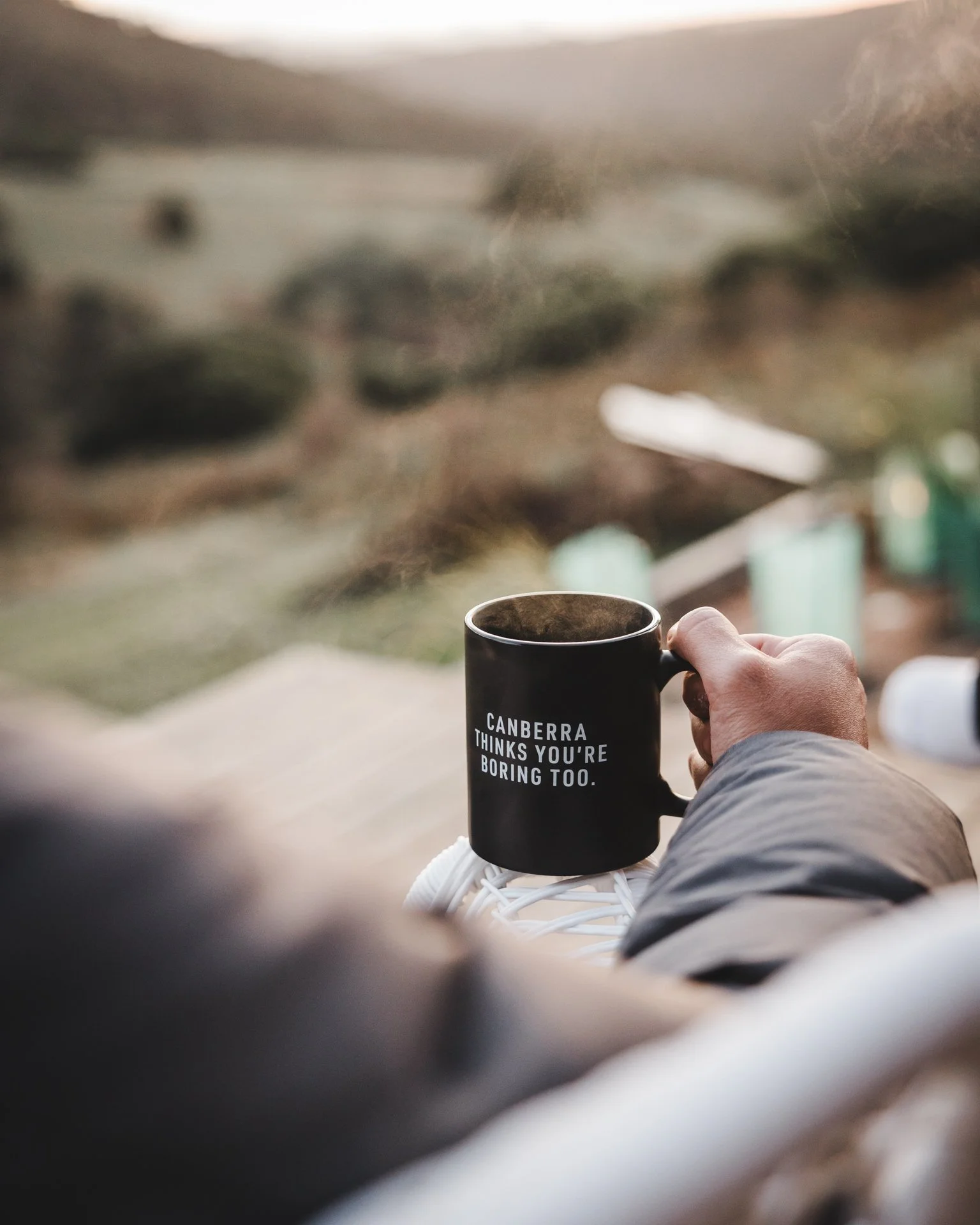
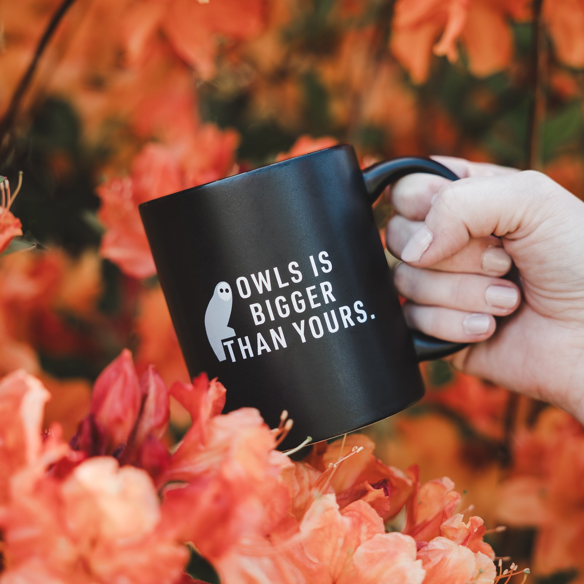
Product photography was developed to feel real and natural rather than staged retail imagery.
The approach focuses on natural lighting, texture and detail, candid contextual moments, and products in everyday use.
The result is imagery that feels like real life rather than advertising.
Product Photography

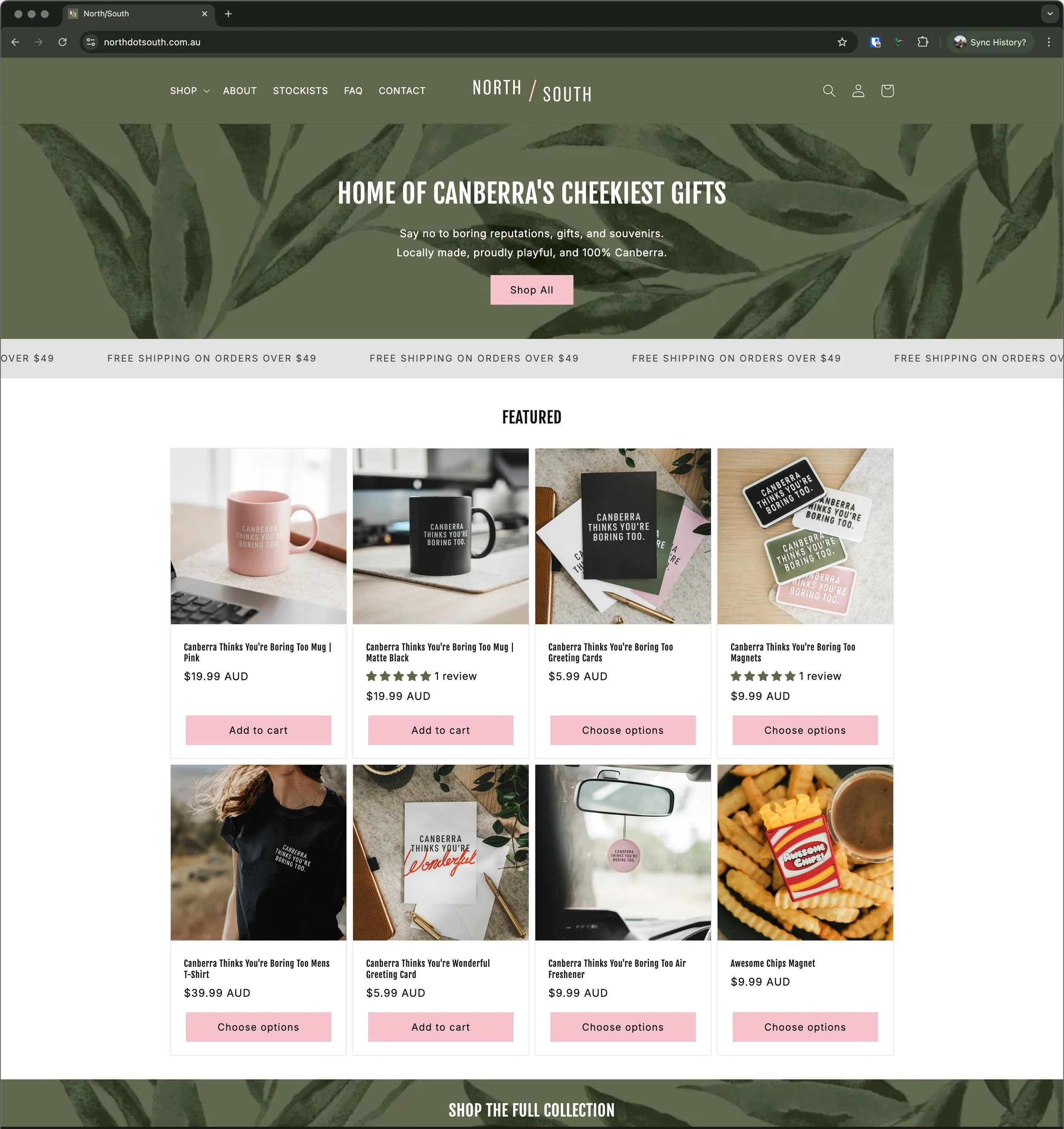
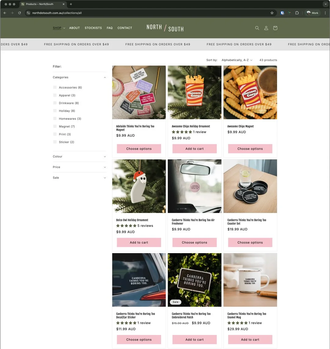
website
Built on the Shopify Platform, the website’s focus was for simple product discovery, mobile first layouts, humour led copywriting, and strong product imagery.
Right from launch, we received a lot of buzz from local publications and micro-influencers, so we wanted to make sure those products were front and centre, and easy to check out with.
To match our overall tone, product descriptions are a bit brash, a bit honest, and seasoned with Canberra-centric references so shoppers feel like they’re part of the club.